Southern Gait Logo Design
Logo design for an up-and-coming equestrian clothing brand.
As a brand new clothing line, it was really fun exploring where we could take this equestrian clothing brand. The look of the design needed to be fresh and modern to appeal to a young audience, but it also needed to represent the traditions and heritage of the equestrian sport.
Step One
Logo Concepts
The main guidance I had going into the first round of concepts is that my client wanted to incorporate some of the traditional equestrian accessories such as the bits and the crop. It was also important that the format of the logo worked well printed and stitched on clothing. She was specifically interested in working in a circular motif as the starting point for the logo.


Step Two
Final Logo Direction
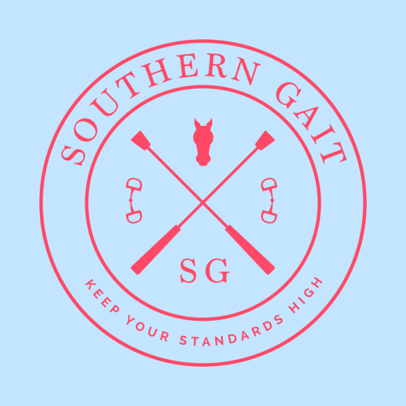
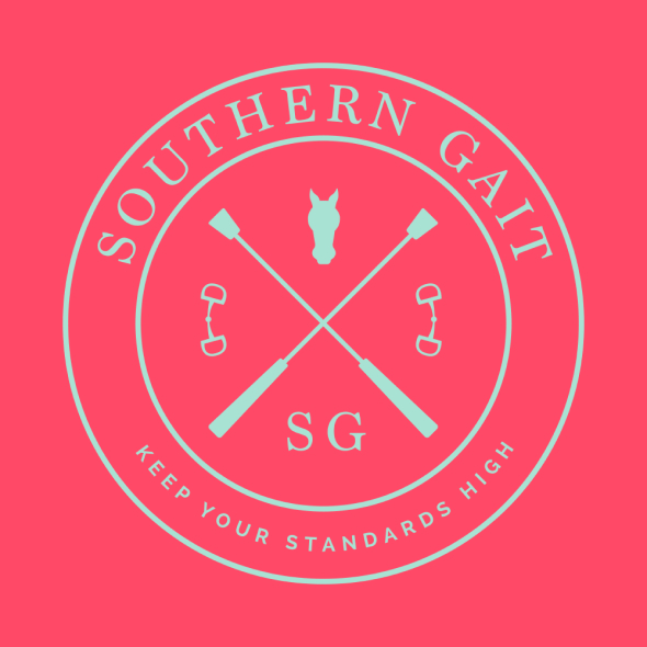
After showing the initial round of logo concepts and making a few tweaks, the client was in love with one of the logo designs. Now that we had a logo selected we started looking at color themes to use in the logo. When creating these we were envisioning them printed on a t-shirt.



Step Three
Men’s Line Logo
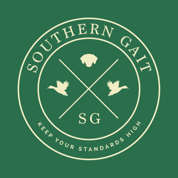
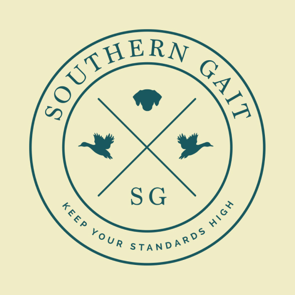
As the business grew beyond women’s clothing the client came back to me to create some additional logos. For the men’s line she wanted to break away from the strong equestrian theme and position it as more of a general outdoors brand.


Step Four
Girl’s Line Logo
As the business grew beyond women’s clothing the client came back to me to create some additional logos. For the kid’s line she wanted something that still fit within the overall brand theme but was a little more playful, girly, and young.


